Generate user interface
ERBuilder allows you to generate a web user interface for your model.
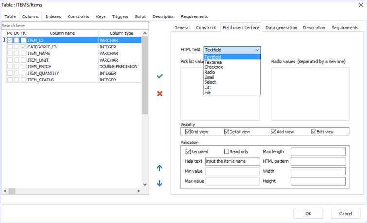
- First, open the “Table” form by double-clicking on the table graphic. In this interface, go to the “Field User Interface” tab.
In this tab, you need to specify the following:
● An HTML field definition for each column of your table. Here are the input types you can use:
|
Textfield |
Defines a one-line text input field. |
|
Textarea |
Defines a multi-line text input field. |
|
Checkbox |
Lets the user select ZERO OR MORE options from a limited number of choices. |
|
Radio |
Lets the user select ONLY ONE of a limited number of choices. |
|
|
Defines an input field that should contain an email address. |
|
Select |
Creates a drop-down list. Define the available options in the list value, separated by line breaks. |
|
List |
Defines an editable list. |
|
File |
Defines a file-select field and creates a “Browse” button for file uploads. |
|
Image |
Lets the user upload an image file. |
|
Date |
Defines an input field that should be a date. |
|
Datetime |
Defines an input field that should include the year, month, day, and time. |
|
Time |
Defines an input field that should be a time. |
|
Number |
Defines a numeric input field. |
● Visibility options. You can set the view type in which this column will be displayed. The available options are:
– Grid view: Displays the column in the record list page.
– Detail view: Displays the column in the details page.
– Add view: Displays the column in the insert form page.
– Edit view: Displays the column in the update form page.
● Validation options. In this section, you can specify one or more validation options for each column, such as Required input or Read-only. Other options available are Max length, Help text, Min value, Max value, HTML Pattern, Width and Height of the input field.
- Navigate to “Tools | Generate User Interface”.
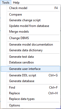
- Once the “Generate User Interface” window is displayed, you can choose between a dark theme and a white theme. You can also specify the output folder. By default, the output folder will be your current project folder.
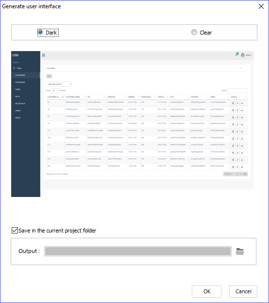
- Open the generated user interface with a web browser.
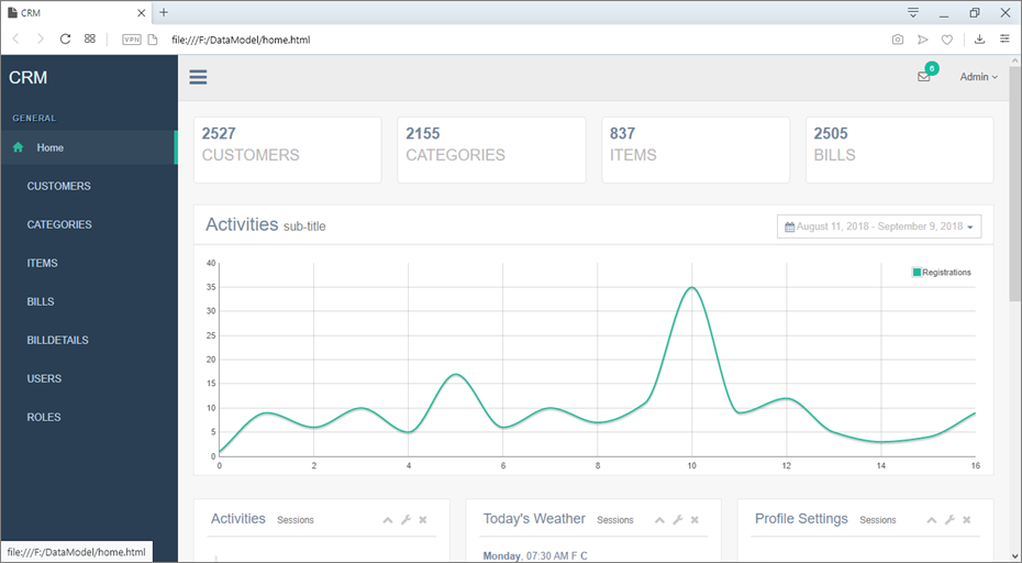
Home interface
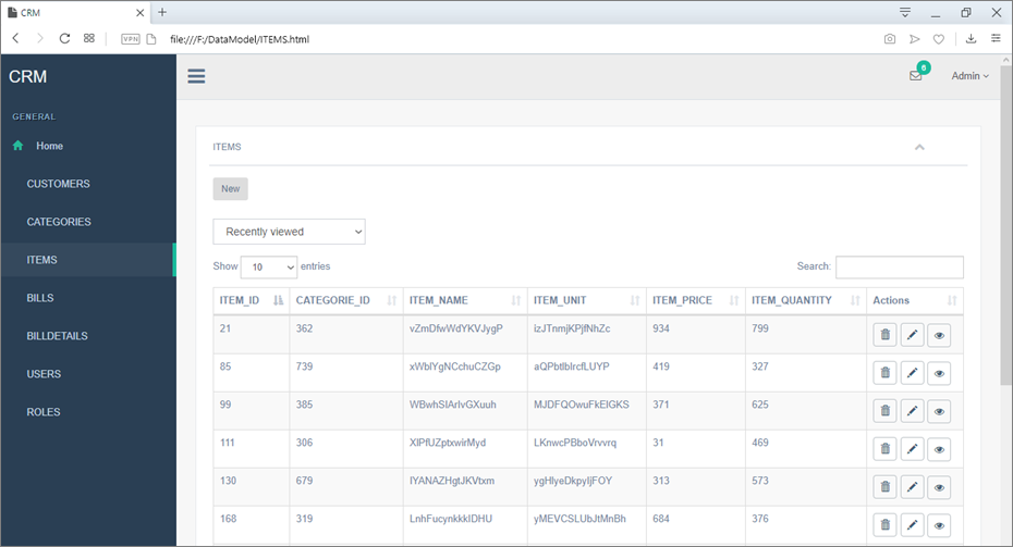
Grid view for the selected table
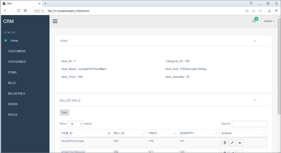
Detail view
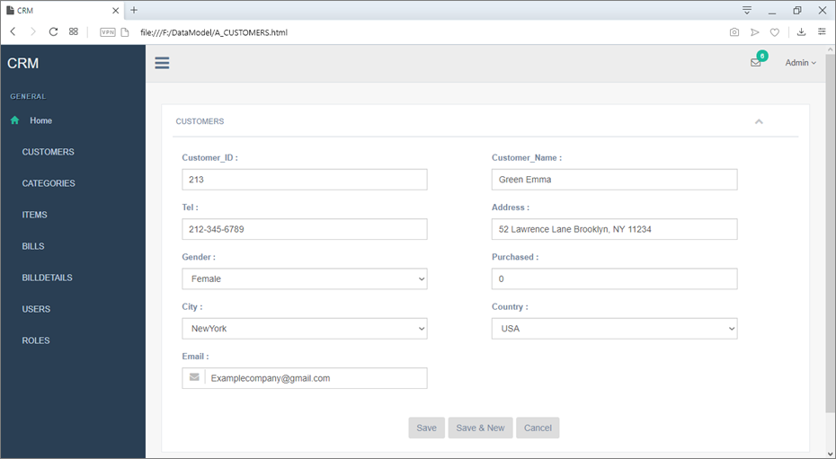
Add an entry view
|
Available in: Enterprise Edition |